
BRANDING & PACKAGING
Adobe Illustrator | Adobe Photoshop | Photography
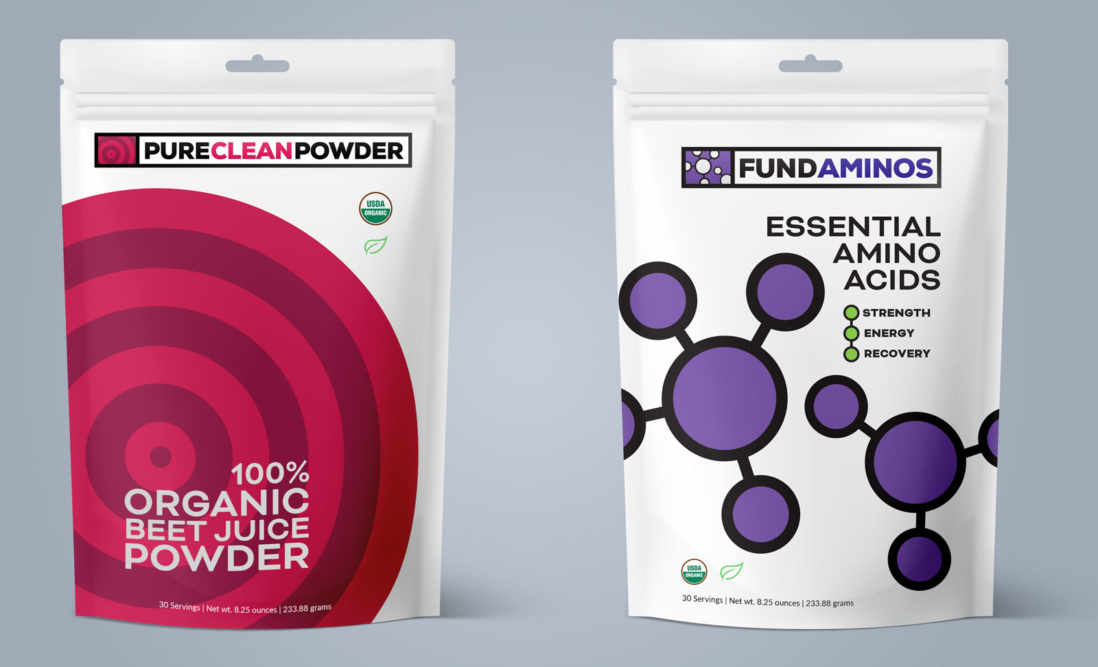
Pure Clean Power emerged from the vision of a Team USA cyclist seeking to create a natural performance supplement. Launching during cycling's controversial doping era, the product's packaging embraces minimalist design to visually differentiate from synthetic, laboratory-created alternatives dominating the market. The intentionally understated aesthetic communicated authenticity and transparency when the sport's reputation demanded it most. Following the company's acquisition by a sports nutritionist in 2015, the original Pure Clean Powder identity underwent strategic refinement, accompanied by the development of three additional logos to support an expanded product ecosystem.
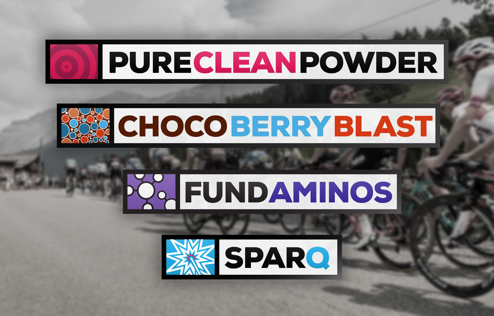
Updated logo and additional products
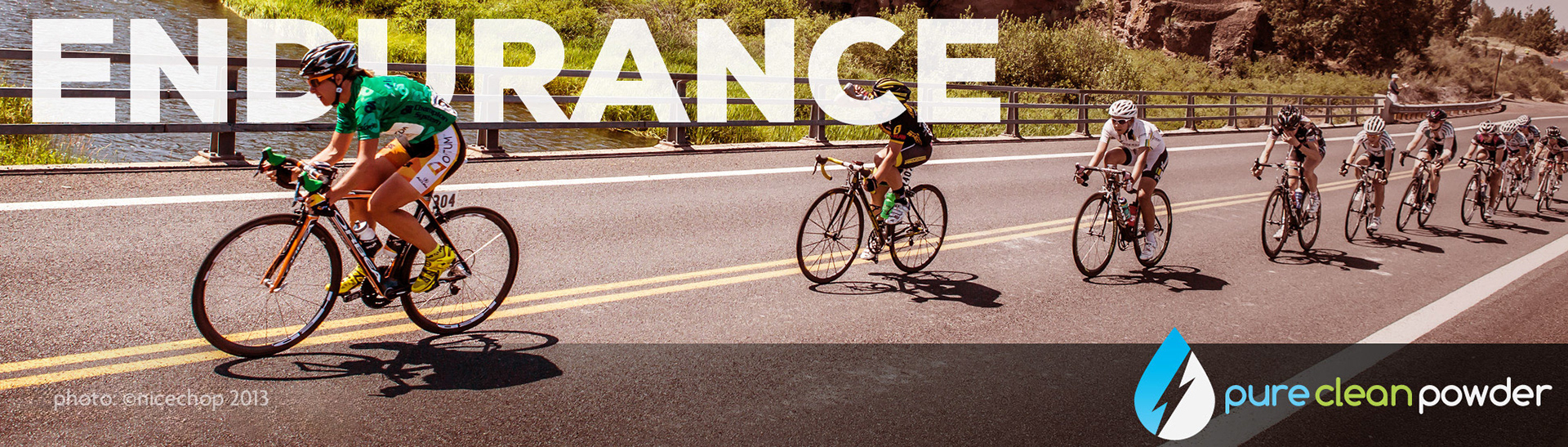
Web ads featuring sponsored athletes
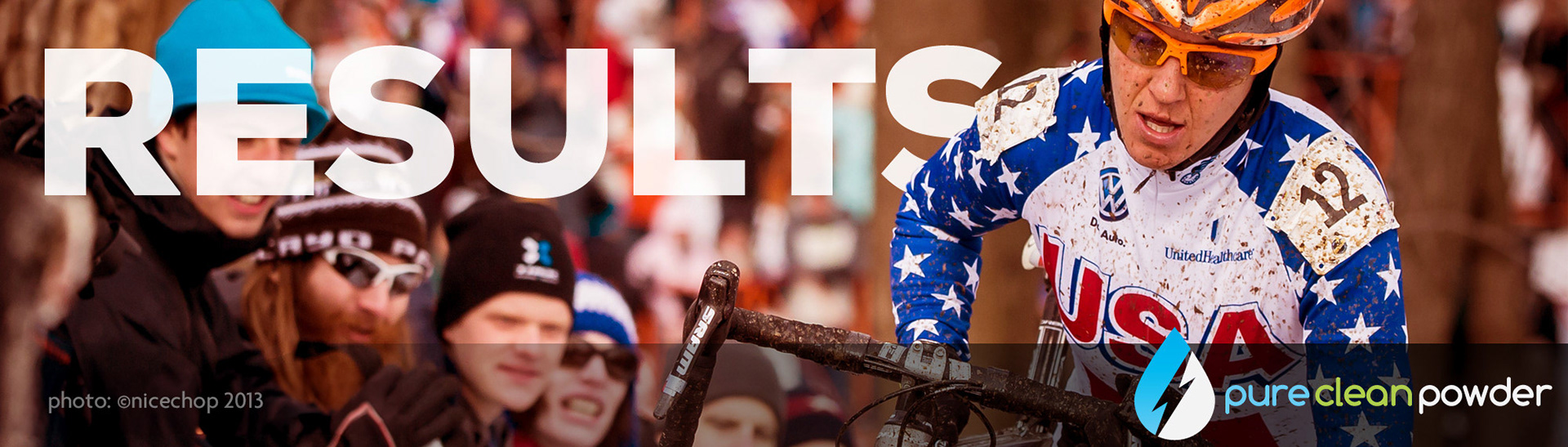
Web ads featuring sponsored athletes

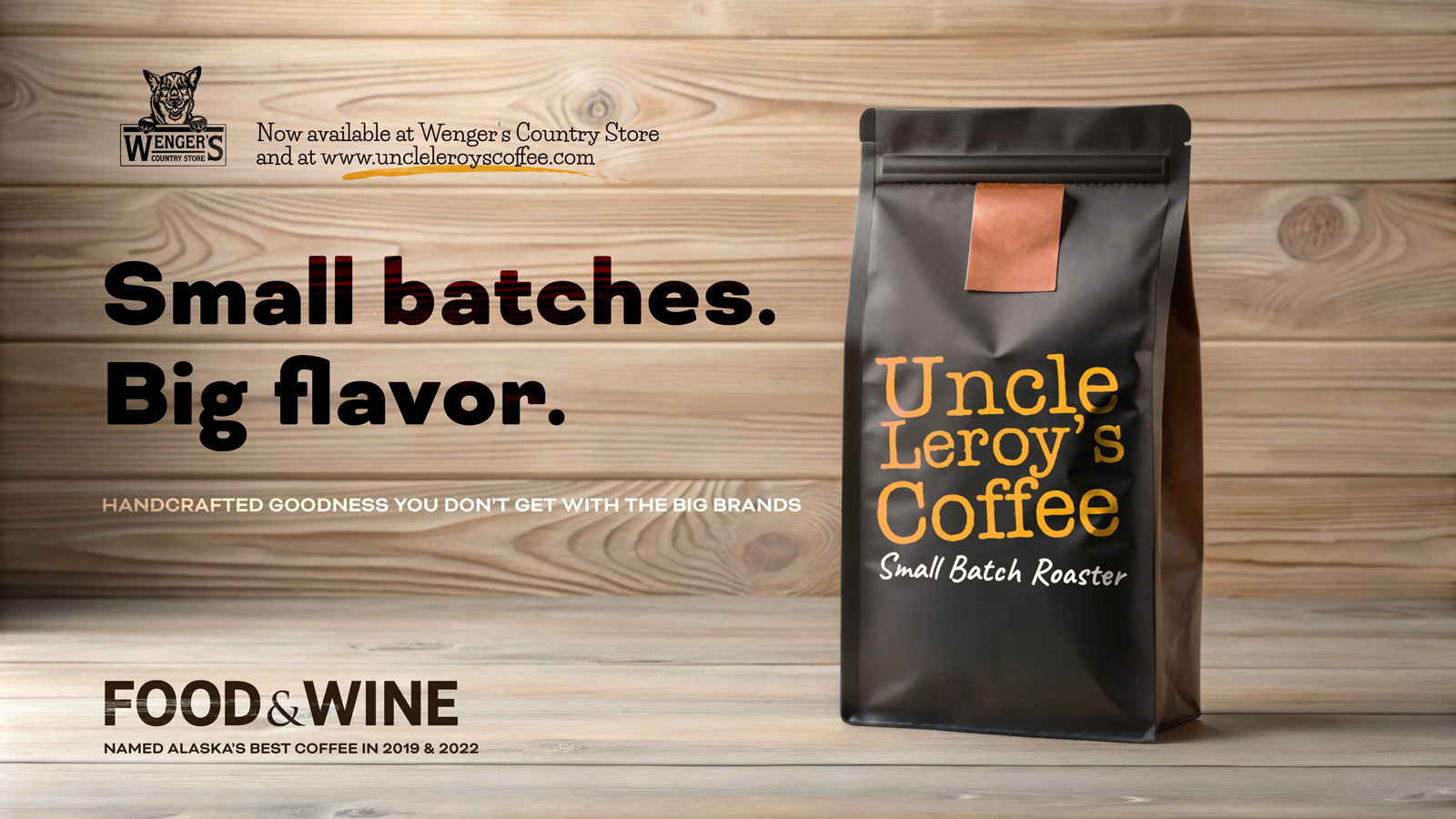
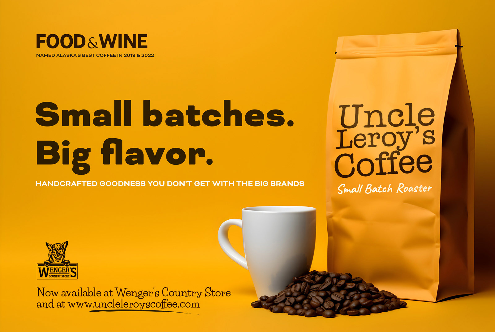
PACKAGING & ADS
Adobe Illustrator | Adobe Photoshop | Generative AI

CYCLING KIT DESIGN
Adobe Illustrator | Adobe Photoshop | Photography
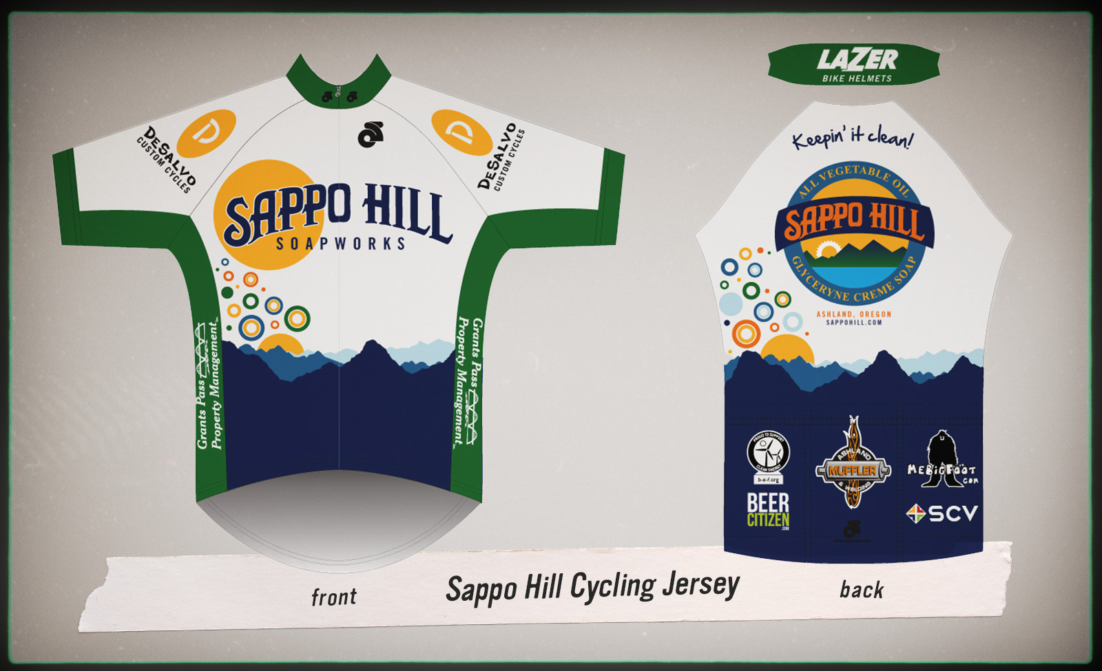
SAPPO HILL SOAPWORKS
Sappo Hill, a dedicated patron of Southern Oregon's competitive cycling community, commissioned this jersey design with remarkable creative latitude. The visual narrative incorporates the region's mountainous training terrain that challenges local cyclists daily. The distinctive golden circular framing of "Sappo" serves as a deliberate reference to the company's iconic round soap products, while the rising bubble element captures the effervescent enthusiasm that defines amateur cycling competitors. Each design element thoughtfully connects the brand's identity with the passionate cycling culture it supports throughout the region.
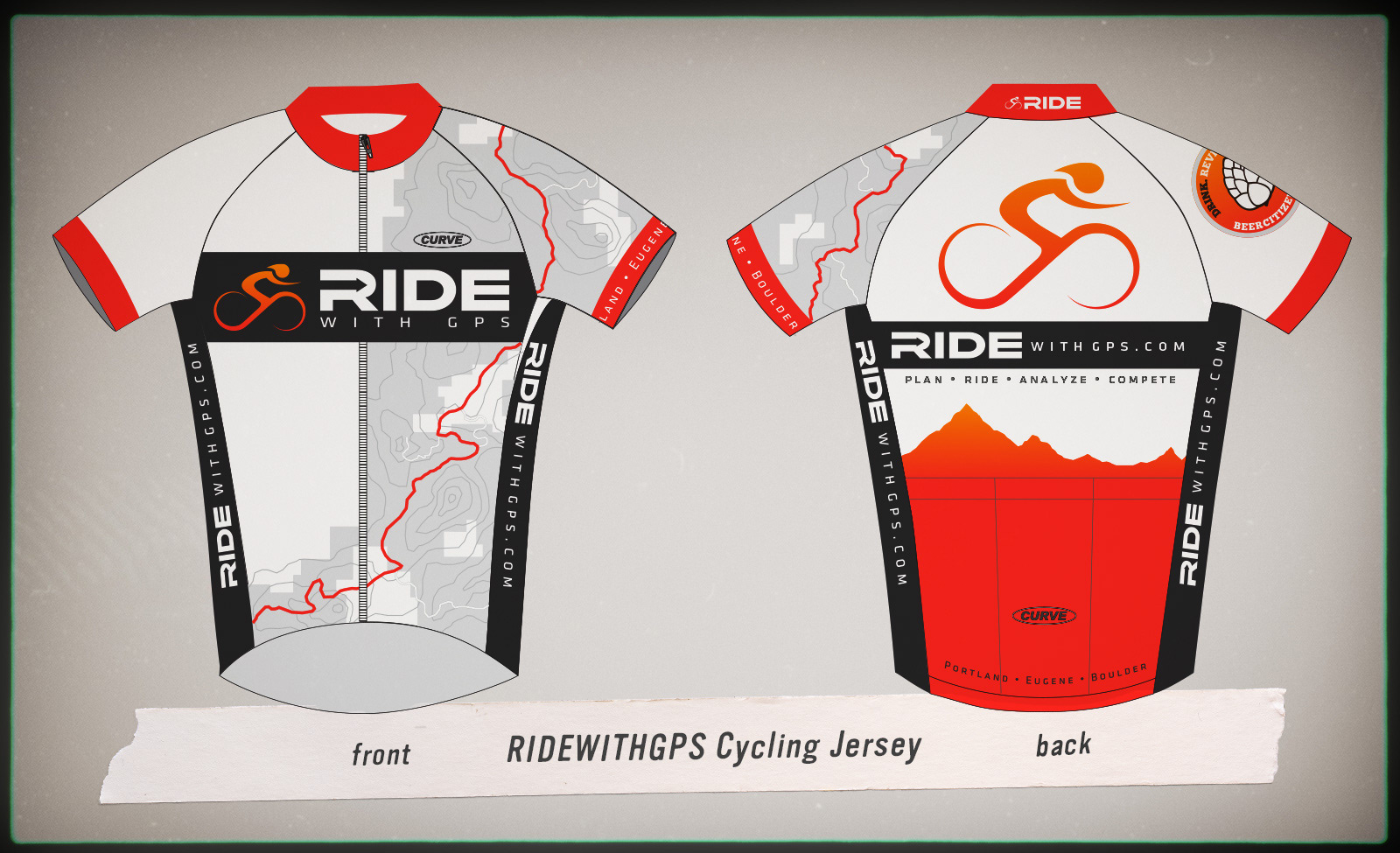
RIDE WITH GPS
Ride with GPS, a Portland-based workout tracking platform comparable to Strava, specializes in mapping athletic activities against topographical terrain. The app's distinctive approach—plotting runs and rides with elevation data visualization—directly informed this jersey design concept. The visual language translates the app's core functionality of revealing the undulating challenges conquered during each workout into wearable form, creating a literal embodiment of the digital experience that resonates with the cycling community's never-ending pursuit of epic rides.
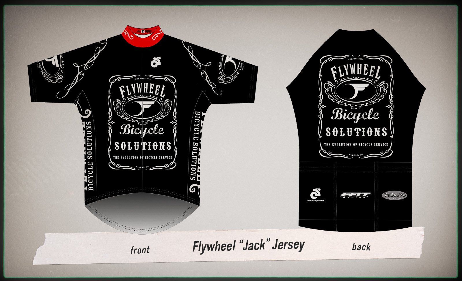
FLYWHEEL BICYCLE SOLUTIONS
Flywheel, a Southern Oregon bike shop with nearly two decades supporting competitive cycling, commissioned this distinctive off-season training kit. The owner's minimal brief—requesting only a dark colorway—provided substantial creative freedom. The resulting "Jack" jersey playfully references a familiar adult beverage, serving as a visual reminder for competitive athletes to decompress following the intensity of race season. This lighthearted design approach intentionally contrasts with typical performance-focused racing kits, reinforcing the psychological shift from competitive pressure to recreational enjoyment during training months.