Adobe Illustrator | Adobe Photoshop | Photography
CHALLENGE
Refresh the logo for DIRT, a nonprofit dedicated to environmental stewardship and citizen science. The organization required maintaining strong brand recognition within its established community while evolving its visual identity.
SOLUTION
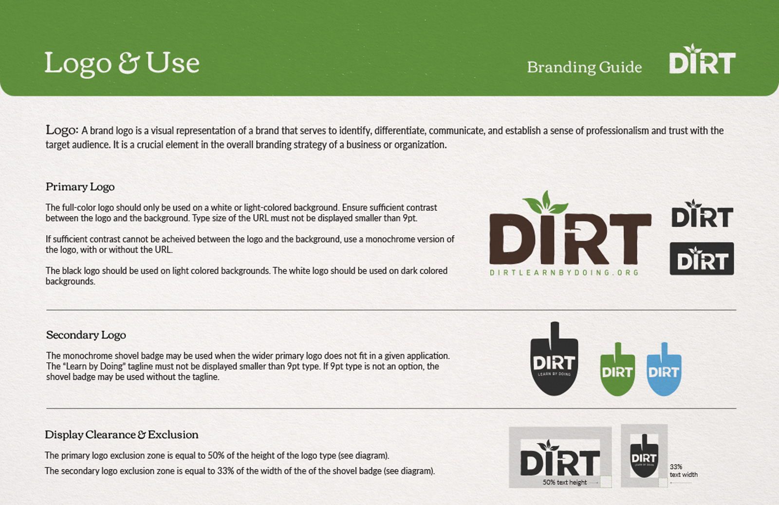
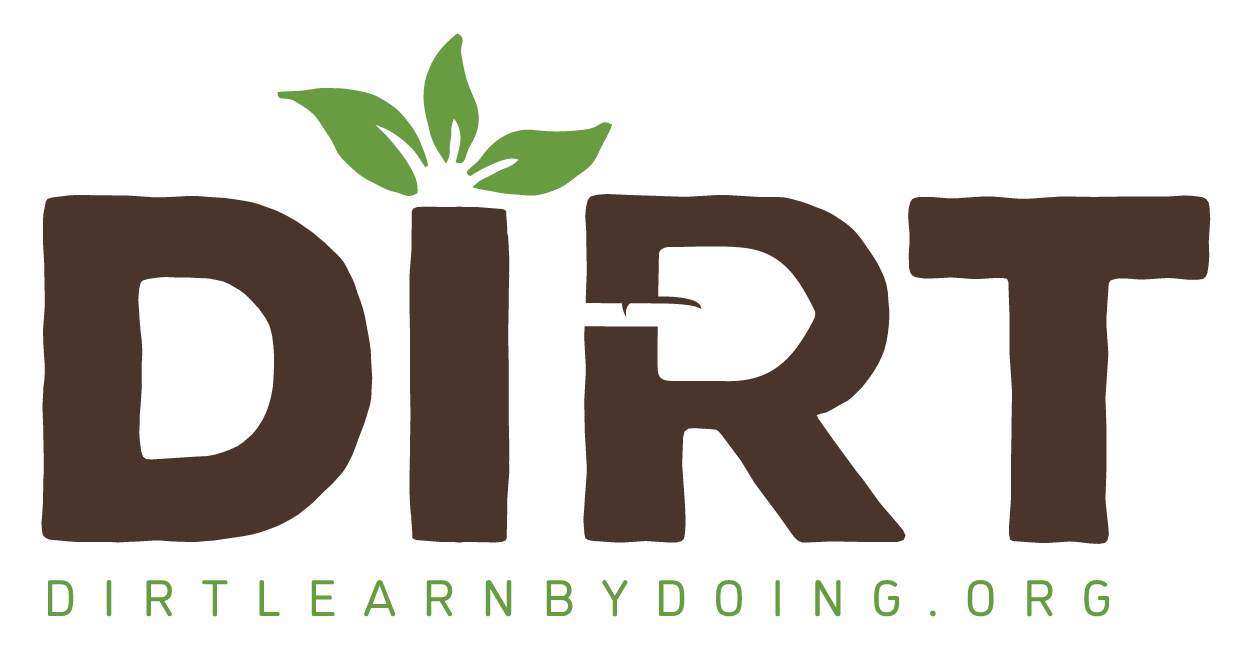
Rather than a complete overhaul, I opted for strategic refinement—preserving the iconic sprouting plant element while introducing greater contrast to the existing color palette. This approach honored brand equity while improving visibility and impact. I replaced the previous typeface with a sturdier font, adding subtle distressing for an appropriately organic texture. The distinctive shovel cutout in the "R" serves dual purposes: symbolizing the hands-on environmental work central to DIRT's mission while creating visual cohesion with the shovel badge variant of the logo system.
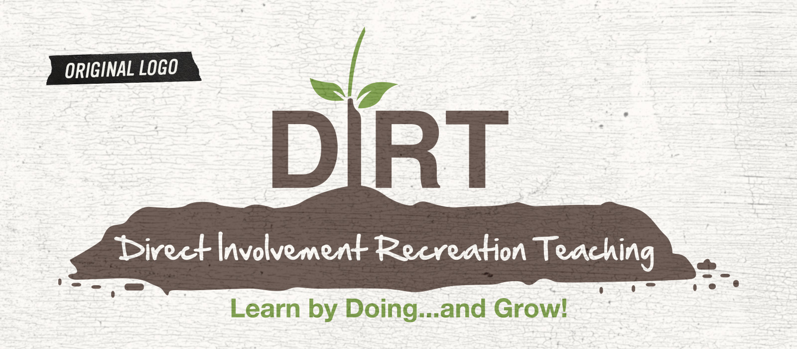
ORIGINAL LOGO
While the client appreciated the symbolic "new growth" sprouting from the "I," they expressed concern that the pile of dirt could be interpreted as a pile of something else entirely. This critical feedback guided our refinement strategy to maintain the powerful growth metaphor while addressing the problematic visual ambiguity.
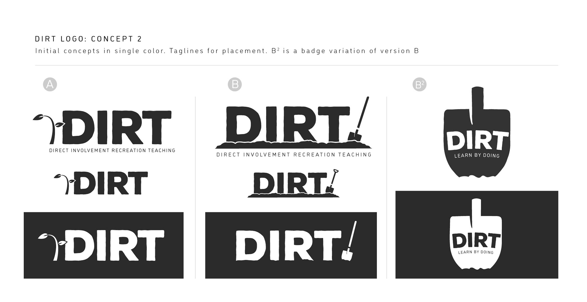
INITIAL LOGO RIFFS
Early explorations maintained the essential sprouting plant element while introducing a shovel motif—a deliberate addition representing the active, participatory nature of the organization's volunteer initiatives. These initial concepts preserved brand continuity through familiar visual metaphors while strategically expanding the symbolic vocabulary to better communicate DIRT's hands-on environmental engagement philosophy.